Advertisements
Choosing a paint color is one of the most impactful yet daunting decisions in home decor. The right hue can transform a room, influence your mood, and tie your entire design together. This comprehensive guide will walk you through expert tips, color mixing principles, and how to accessorize for a harmonious and stylish home.
Part 1: The Foundation – Choosing Your Color Palette
1. Understand the Psychology of Color:
Colors have a profound effect on our emotions and perceptions. Start by considering the mood you want to create in each room.
- Blues & Greens: Calming, serene, and refreshing. Perfect for bedrooms, bathrooms, and home offices.
- Yellows & Oranges: Energetic, warm, and cheerful. Ideal for kitchens, dining rooms, and entryways.
- Reds & Pinks: Passionate, stimulating, and cozy. Use as an accent in dining rooms or living rooms.
- Neutrals (Whites, Grays, Beiges): Versatile, timeless, and spacious. They form the perfect backdrop for any style and allow your furniture and art to pop.
2. Work with the Lighting:
Lighting is the most critical factor in how a color appears.
- Natural Light: Shows the truest color. North-facing rooms have cool, bluish light (better for warm colors). South-facing rooms have warm, bright light (handles both cool and warm colors well).
- Incandescent Light: Emits a warm, yellow glow, enhancing warm colors (reds, oranges, yellows) but muting cool ones.
- Fluorescent/LED Light: Casts a sharp, bluish cool light, amplifying cool tones like blues and greens.
- Pro Tip: Always test your top choices! Paint large swatches (at least 2’x2′) on multiple walls and observe them at different times of the day.
3. Consider the Room’s Purpose and Size:
- Small Rooms: Light, cool colors (pale blue, soft gray) can make a room feel more open and airy.
- Large Rooms: Dark, warm colors (navy, charcoal, deep terracotta) can make a vast space feel more intimate and cozy.
- High-Traffic Areas: Choose durable, satin, or semi-gloss finishes that are easy to clean (e.g., hallways, kids’ rooms, kitchens).
4. Create Flow from Room to Room:
Your home should feel connected. A good rule is to choose a core neutral color and use variations of it in adjacent rooms. You can then introduce different accent colors in each space to define them. Using a consistent trim color throughout (e.g., bright white) is a classic technique to create unity.
Part 2: The Art of Color Mixing and Schemes
Don’t just pick single colors; create a sophisticated color scheme.
- Monochromatic: Uses different shades, tones, and tints of a single color. This is the easiest scheme to achieve and always looks elegant and cohesive. (e.g., light blue walls, a navy blue sofa, and sky blue pillows).
- Analogous: Uses colors that are next to each other on the color wheel. This scheme is harmonious and pleasing to the eye. (e.g., blue, blue-green, and green).
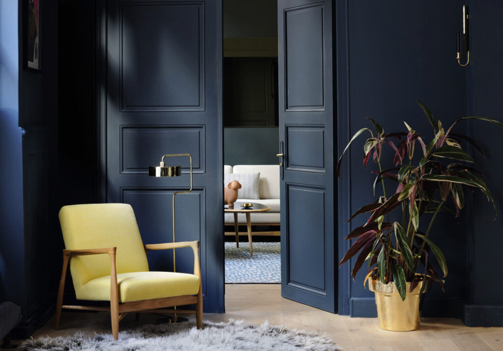
- Complementary: Uses two colors that are opposite each other on the color wheel. This creates a high-contrast, dynamic look. Use the 60-30-10 rule: 60% dominant color, 30% secondary color, and 10% for the pop of the complement. (e.g., blue and orange, gray and a pop of yellow).
- Triadic: Uses three colors that are evenly spaced on the color wheel. This scheme is vibrant and balanced. (e.g., red, yellow, and blue).
Part 3: The Finishing Touches – Design and Accessories
The paint is on the walls, now it’s time to bring the room to life.
- Textiles are Key: Your curtains, rugs, and throw pillows are the bridge between your wall color and the rest of the room. Pull a secondary or accent color from your scheme for these items.
- Metallic Accents: Gold, brass, and copper add warmth and glamour to cool-toned rooms. Silver, chrome, and nickel provide a sleek, modern contrast to warm walls.
- Artwork: A large piece of art can tie all the colors in a room together. Use your wall color as a background to make your art collection the star.
- Furniture: A statement piece of furniture in a contrasting color or natural wood tone can ground the space and add visual interest.
- Natural Elements: Incorporate wood, plants, wicker, and stone. These organic textures work with any color scheme and add life and balance to a room.
Advertisements